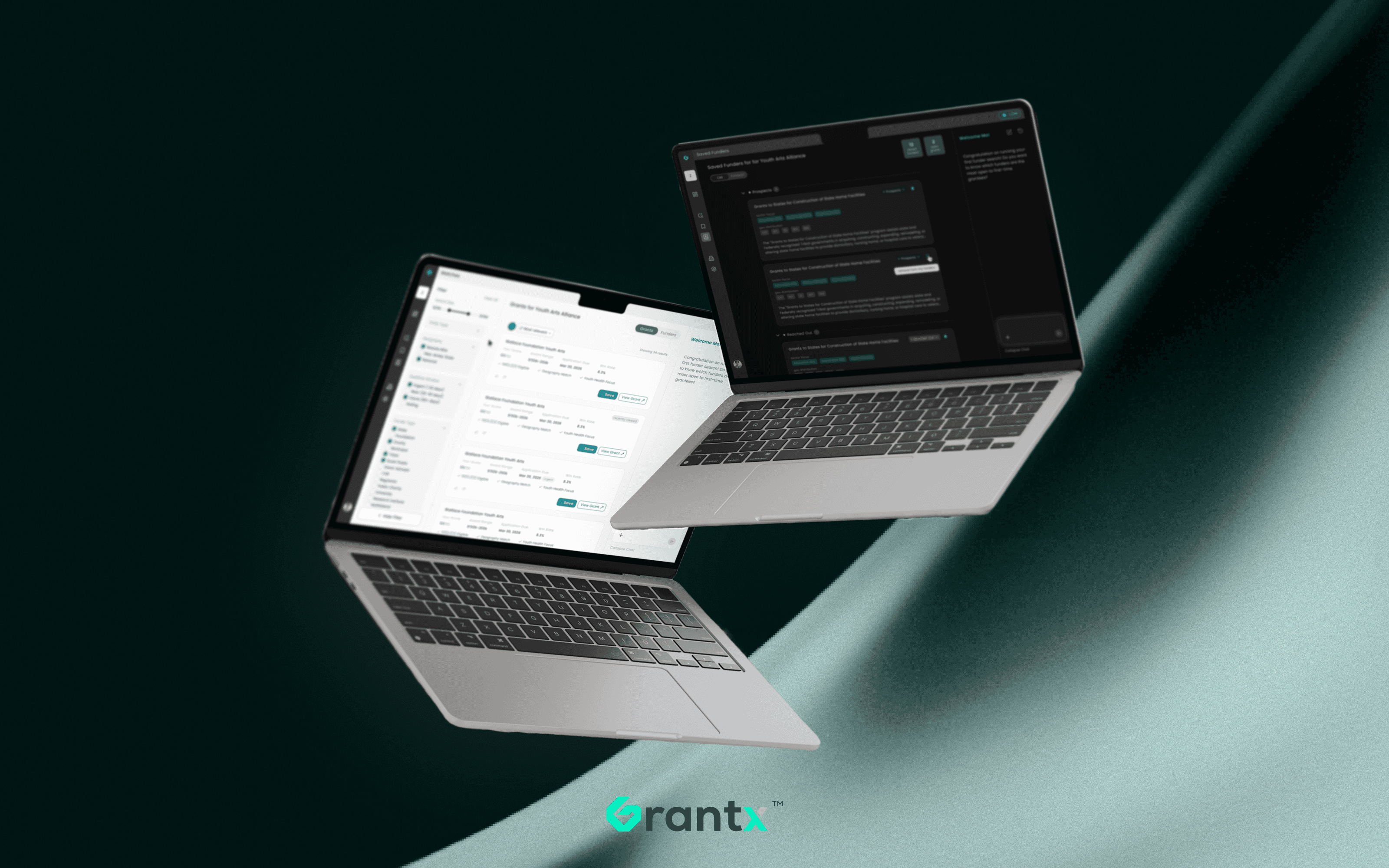
Grantx - B2B Agentic AI Funding Platform
How do you make users trust a data and AI product they can't see inside?
AI
B2B
Product Design
Design System
User Research
about grantx
High-impact projects stall on grant complexity, not vision.
Grantx uses predictive AI to surface the right funding in minutes, not weeks.
ROLE
Founding Designer,
0→1
TEAM
2 Design,
1 PM,
2 Data Sci,
3 FS,
2 ML
TOOL




COMPANY
Grantx
COMPANY
Grantx
YEAR
2025 – 2026
Context
The Problem

Brilliant people are spending their time on grant paperwork instead of the work that matters.
image sourced from Pinterest
2. early Traction, real impact
We Achieved
x
growth in users post v1 launch
x
better match performance than other standard search approaches
<
min
to a complete funding strategy, down from hours or days
Understanding the Space
Why Grant-seeking is Broken
Thousands of organizations leave funding on the table, not because grants don't exist, but because finding the right ones is a full-time job most teams can't afford. So we started by understanding the space.
Grantx set out to solve one thing: make the right funding opportunities findable in minutes, not weeks, by replacing manual database trawling with an AI that understands the organization, not just its keywords.

The Grant Process, Before and After


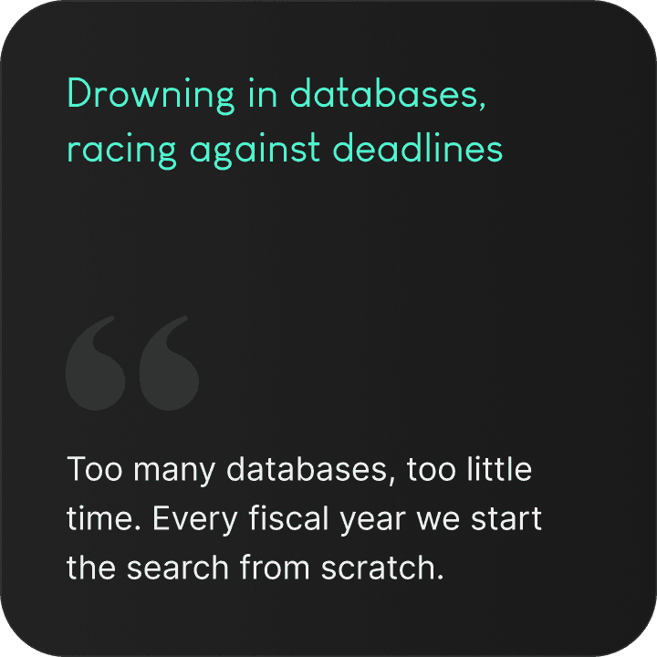
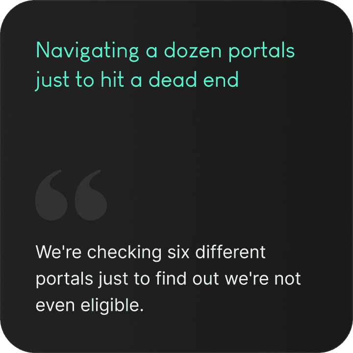
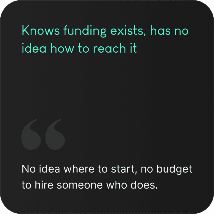
Who we're designing for



how we worked
Design Process
Being the first designer in the room
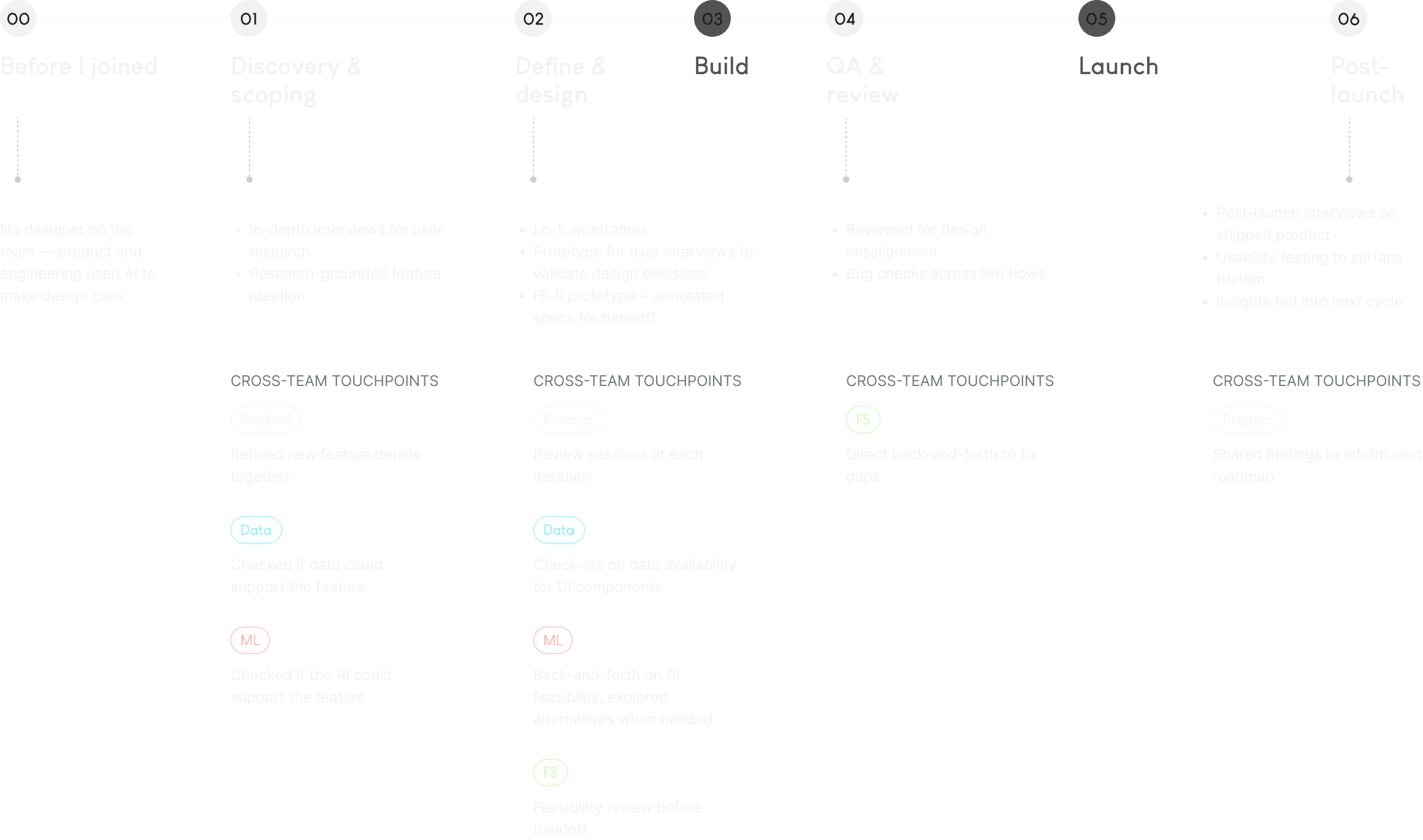
The Challenges
01. No playbook
We were designing in the dark. No comparable product, and no patterns to borrow.
02. Designing trust into every interaction
Trust is the whole game. We had to make the AI's reasoning visible, its actions predictable, and its mistakes recoverable
03. Making the AI feel like a colleague, not a chatbot
We didn't want to ship another LLM wrapper. The goal was an AI that does the heavy lifting, so our users don't have to.
Trust by Design
Designing the AI Experience
Designing an agentic AI product means confronting a set of hard questions — ones without obvious answers.
Transparency
The AI is doing complex work behind the scenes. How much of that process should users see — and in what form?
Human Control
Where does autonomy end and overreach begin?
Explainability
Results mean nothing if users can't evaluate them. How do you surface reasoning?
Credibility
AI can be wrong. How do you present output users feel equipped to trust?
These feel like separate problems. But the more we dug in, the more they all pointed to the same thing.
Not about transparency, not about control. It's a trust problem.
I do not really think about trusting or not trusting AI. I treat it like information from another person.
— Research participant, Fundraiser
i. FIRST IMPRESSION
Before a user reads a single result, they've already formed an opinion.
the Avatar

According to Shape of AI, an avatar has three jobs: communicate state, anchor identity, and mediate trust. Our X mark handles all three. Derived from the Grantx logo — instantly recognisable. Abstract enough to avoid false intimacy. And designed to look intelligent enough to be trusted.

the NAME
Candidate
Sunny
Chosen
AI Grant Professional
A human name creates false intimacy without earning trust. Users aren't looking for a friend, they're looking for someone who knows what they're doing. NN Group research backs this up: descriptive names outperform human names in professional AI contexts.
The visual
If the content looks like everything else, users have no reason to trust it came from somewhere smarter.
A teal border, a neon gradient, a star — three signals that have become the shared visual grammar of AI products. We didn't invent the language. We made sure we were fluent in it.
ii. MAKING SENSE OF IT
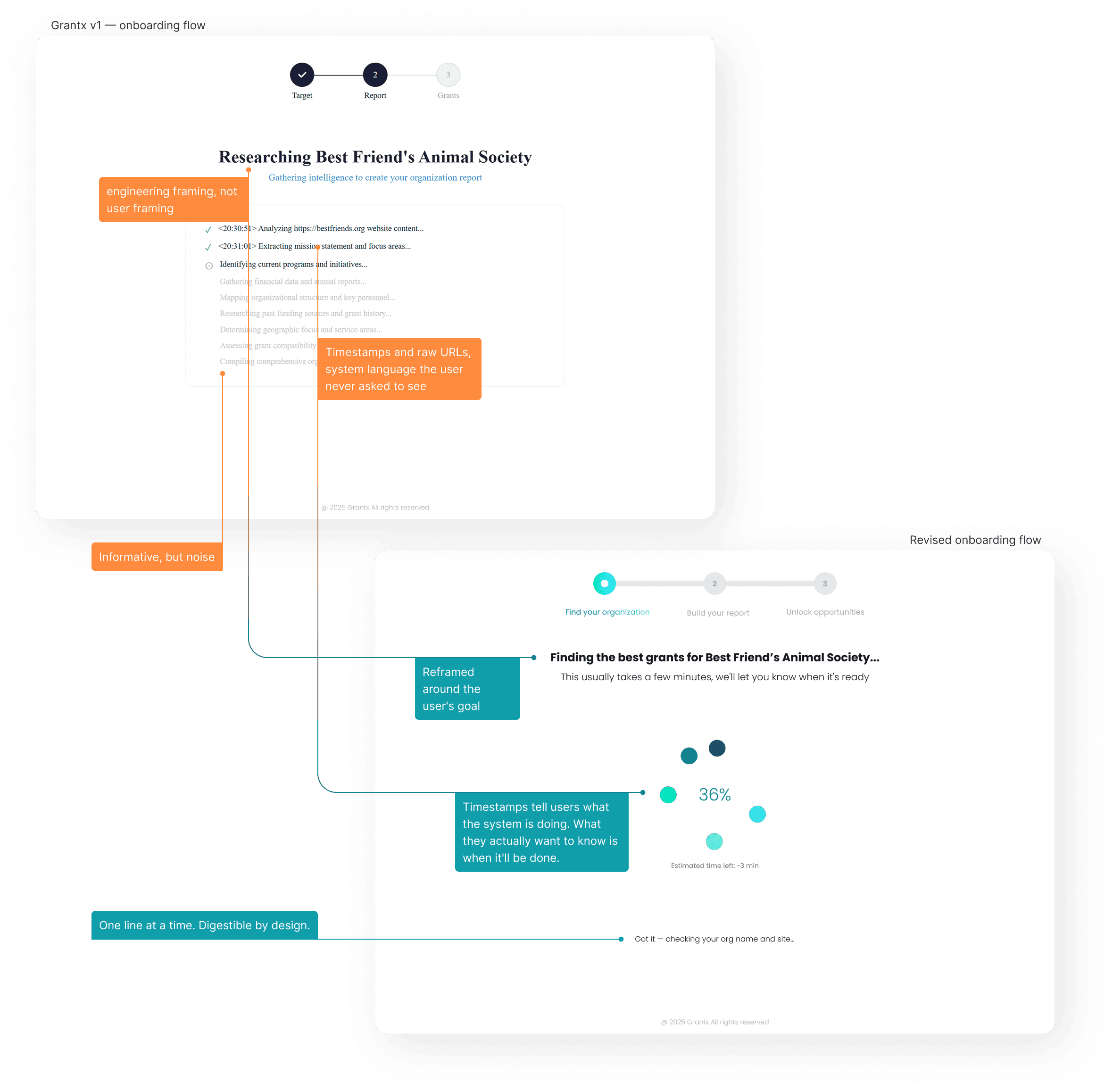
The AI is doing a lot. That doesn't mean users need to see all of it.
TRANSPARENCY ≠ SHOWING EVERYTHING
When the AI is working in the background, the instinct was to show users every step. But pulling the backend to the front doesn't build trust. It creates noise.
Transparency is about showing the right things. The reasoning that helps users evaluate, not a log of everything that happened.
iii. FORMING A JUDGMENT
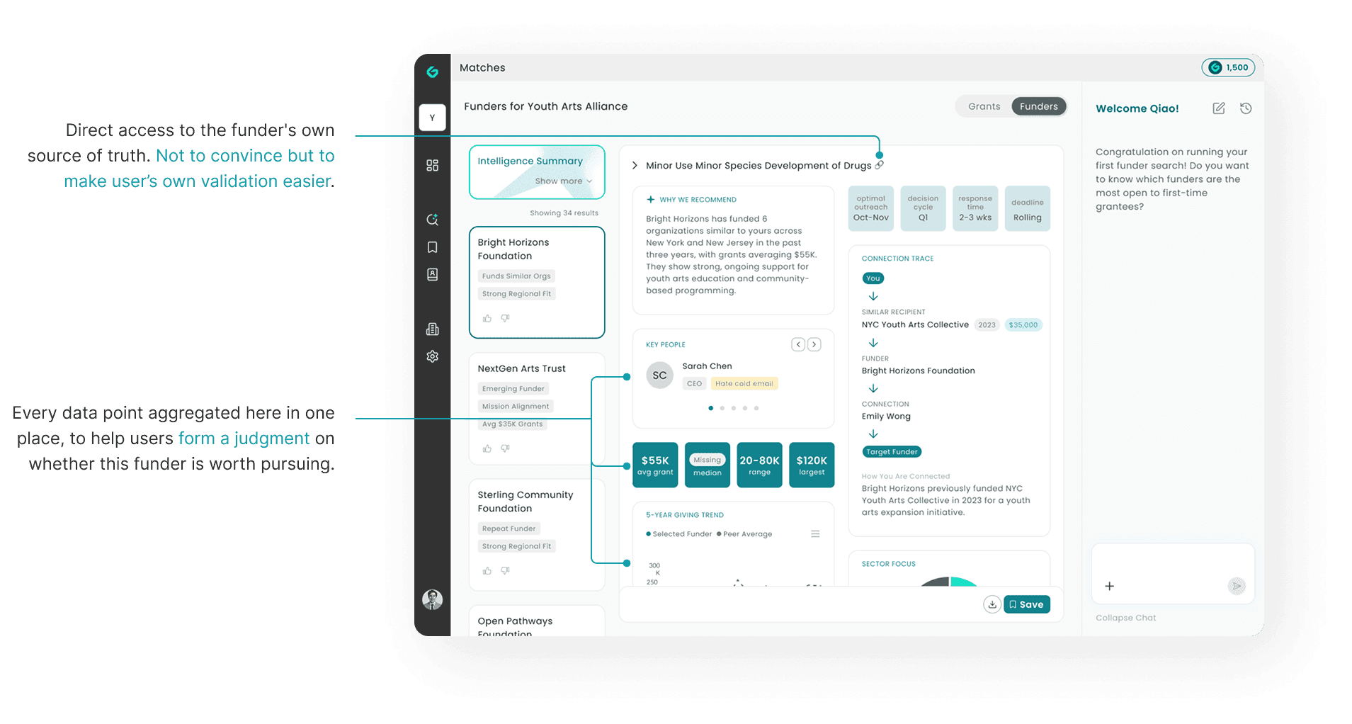
Our job isn't to convince but to make validation easier.
Most grants aren't won on merit alone. Cold applications rarely land, and many funders only give to organizations they already know. Some grants are even invite-only. Getting funded is as much about being in the right network as it is about fit.
We designed the flow to mirror how users naturally research: narrow by fit, then figure out how to get in. Not a ranked list to accept, but a process that puts their judgment at the center.
WIREFRAMING
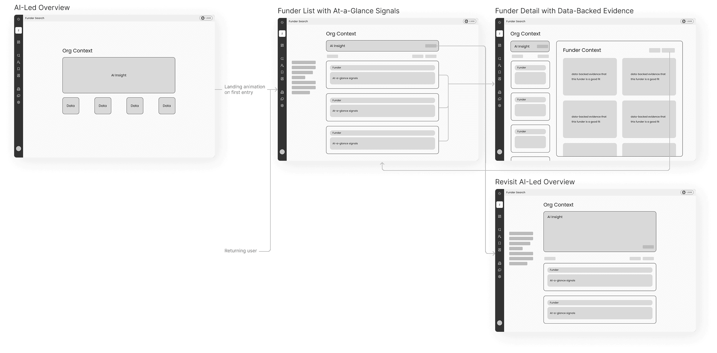
No score. A reason.
A score on its own means nothing. Without context, users can only accept or reject it — they can't evaluate it. We surface the reasoning instead, so users can bring their own judgment to the decision.
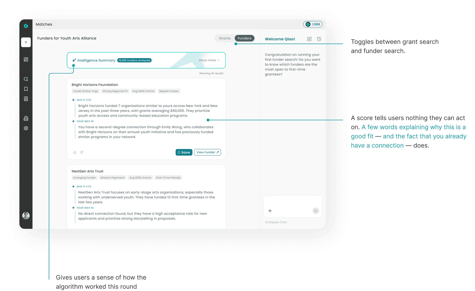
EVIDENCE, NOT ASSERTION
Every recommendation is supported by what we actually know — who this funder has funded before, how much, how recently. Not to overwhelm, but to give users something real to stand on.
How we kept improving
The Small Changes that Made a Big Difference
What users HAVAE told us
The grant search page is one example of how we work, ship, listen, then improve. It has a lot going on: org context, filters, results, financial data, AI analysis, chat. Useful in theory, but too much to hold at once. So we ran usability sessions to find out where users were losing the thread.
Old v2 grant search design. Information-dense and difficult to orient.
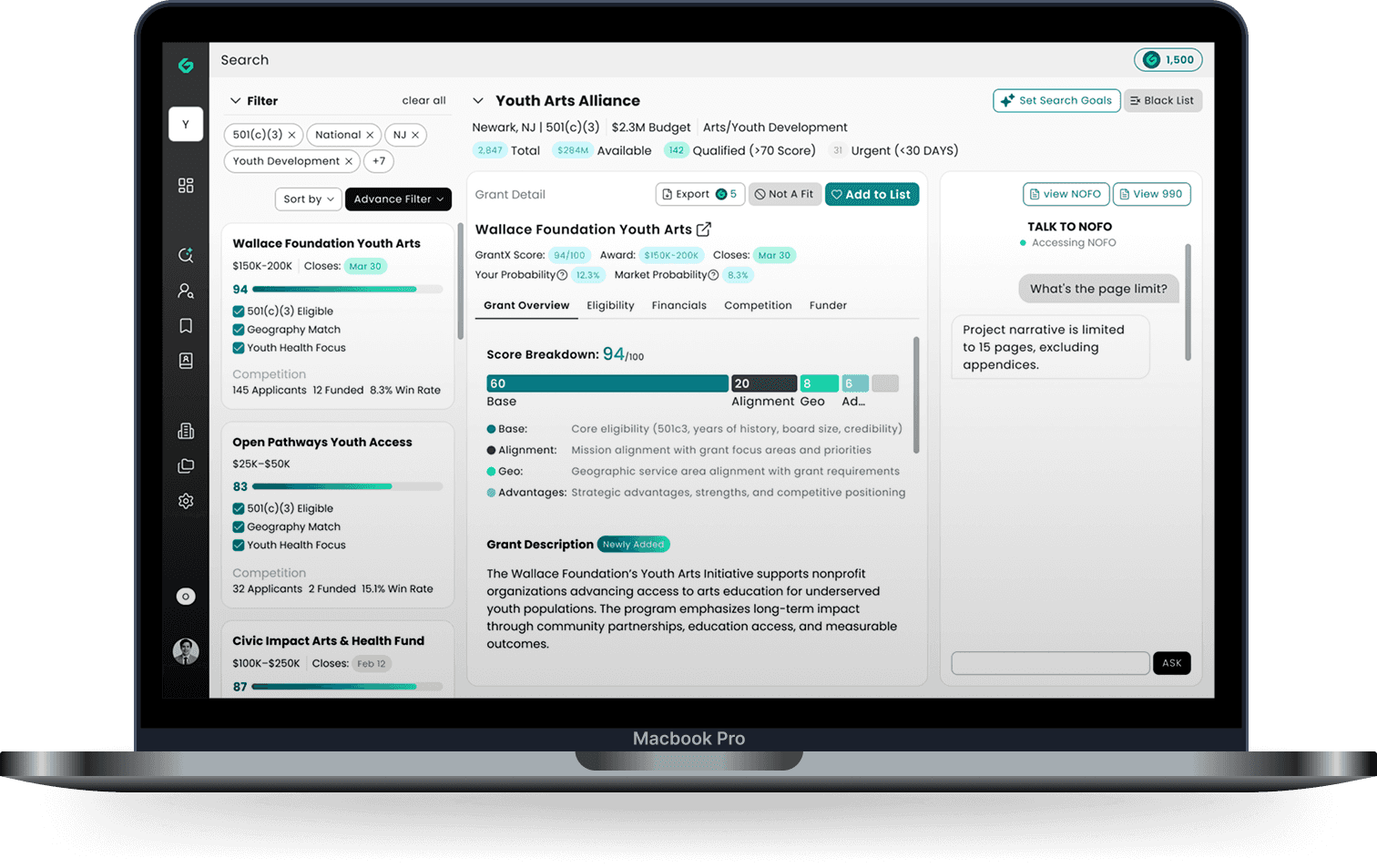

There's a lot of data here. Some of it feels useful but… I'm not sure what half of it is actually telling me.
— Project Manager

Once you walked me through it, I got it, but before that I had no idea you had all this information stored.
— Grant Professional

Wait, are the results on the left? What's the panel in the middle for?
— Program Director
Improving discoverability
When every element competes for attention, nothing stands out. The primary color was doing too much — and Save, the most important action on the page, disappeared into the noise.
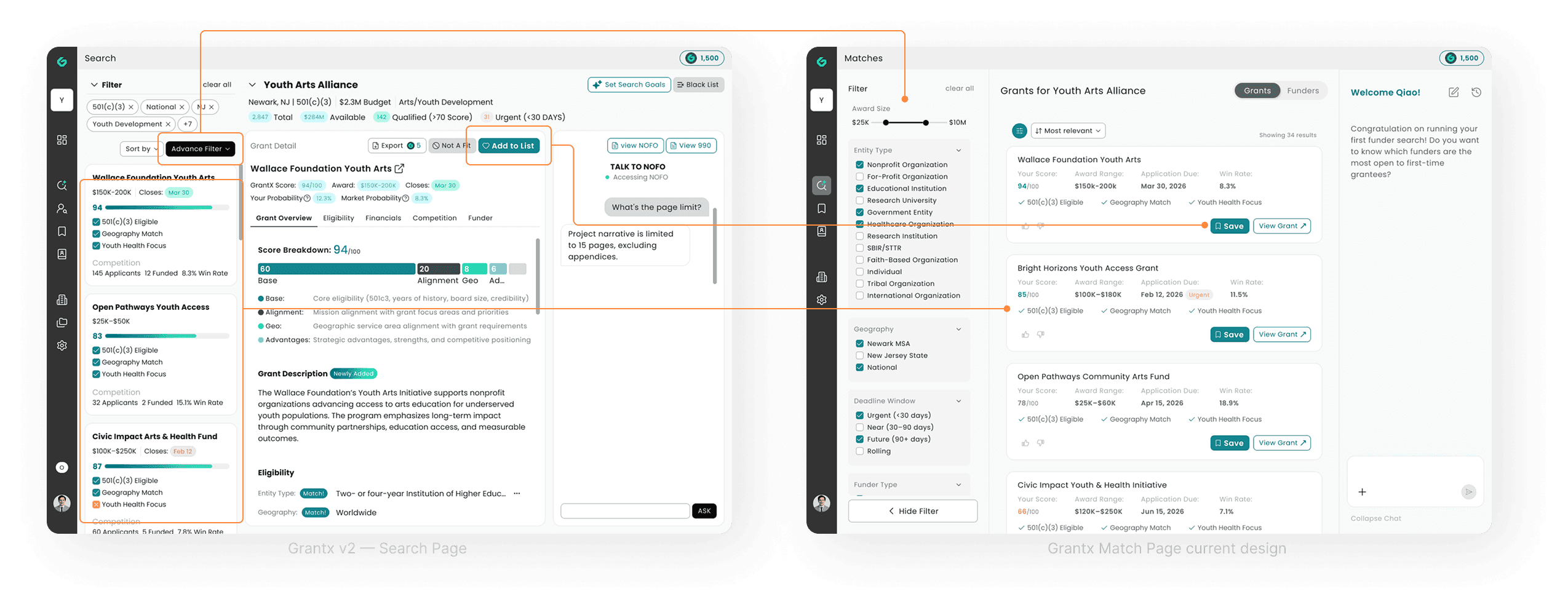
i. Removed the detail panel as default view
opening to a list first, detail on demand. Users orient faster when they're not immediately overwhelmed.
ii. Reduced primary color usage
teal reserved for Save and key actions only, so the eye knows exactly where to go.
iii. Improved spacing and layout
more breathing room between result cards, clearer visual separation between filter, list, and chat.
iv. Made post-search filters more prominent
reducing friction for users who want to narrow results.
Improving clarity
More data felt like more value. Users proved us wrong. What they needed wasn't more . It was the right information, in the right order.
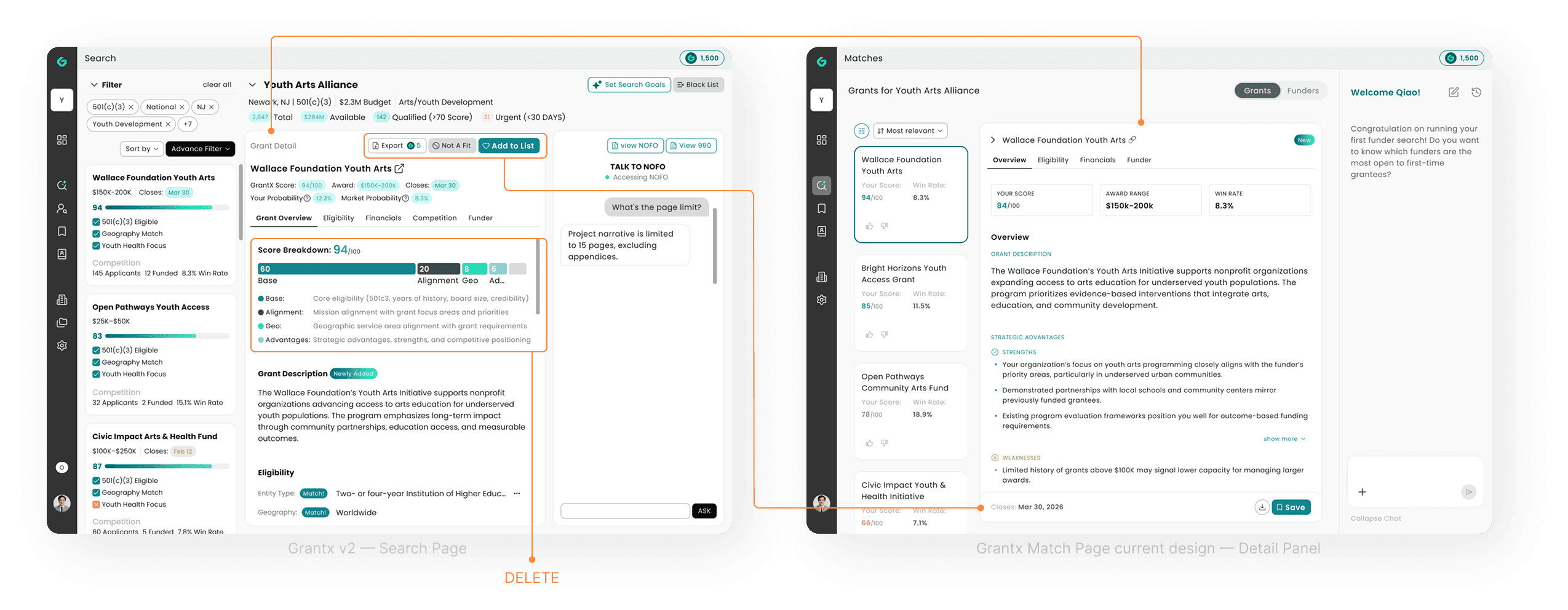
i. Removed score breakdown
It explained the algorithm, not the fit. Users couldn't act on it, so we cut it.
ii. Detail panel on demand, not default
opening to the list first establishes context. Users now know what the detail panel is for before they're inside it.
iii. Cleaned up the action area
No more hunting for the button at the wrong moment.
iv. Stripped the header
If users couldn't explain why a data point mattered, it didn't stay.
Improving legibility
Labels like "Qualified (>70)" and "Strong (>85)" told users how we scored them, not what to do with the information. We rewrote every label to say what it means in plain language, so users spend time deciding, not decoding.
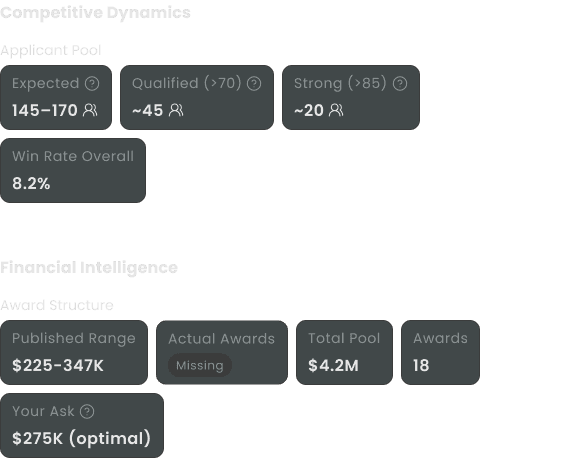
Old v2 grant detail panel - data chip
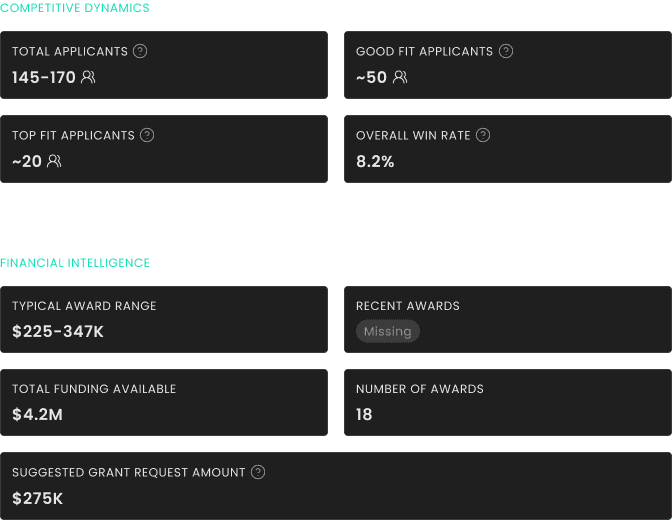
Current design